Bovada Poker Website & Table
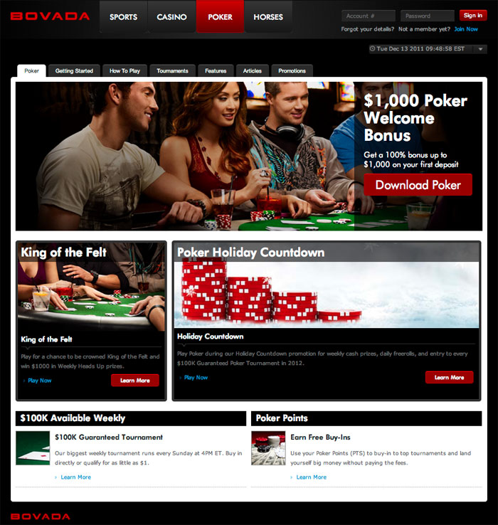
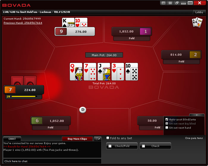
This article is being written on the very day that Bodog Poker re-branded in the United States to Bovada Poker. Some changes have been made to the website, and to the poker tables as well. Below are screenshots of the website and poker table, along with some changes pointed out. Check out our Bovada Poker review for more information.
Bovada Poker Website
Obviously the first thing we see is the new Bovada logo at the top of the website. However, that wasn’t what caught my eye. What grabbed me is the new bonus Bovada Poker is offering – 100% up to $1000. That’s a huge bonus, and after checking the clearing requirements most players can earn a nice chunk of it. The clearing requirements are much easier than most online poker sites. Also, they’ve kept the ‘Points for Cash’ promotion going, where players can trade their poker points for real money, instead of just crappy poker swag that we don’t want anyway. Very cool.
Overall, the design of the new Bovada Poker website is very similar to the previous Bodog website. It is still very contemporary and clean, making it easy to navigate. At the top of the website are huge links to different areas of the site, which include the poker room, sportsbook, casino, and racebook.
Bovada Poker Table
The screenshot of the Bovada Poker table below was from the day they re-branded from Bodog. You’ll notice some missing elements, like player names and avatars. In time, we expect these features will be added back to the table options. We’ll try to update this screenshot as we notice new features, but it’s possible things will have changed by the time you’re reading this. See the Bovada Poker tables for yourself.


